UX/UI
Team: 3 people
Duration: 6 weeks
Tools: Figma, Jamboard
Sketches, Prototyping, Wire-framing, User Research, User Testing
For Indiana University students and staff who are health conscious or who want to be physically active on or off campus, there is limited access and times that allow people to workout efficiently and effectively.
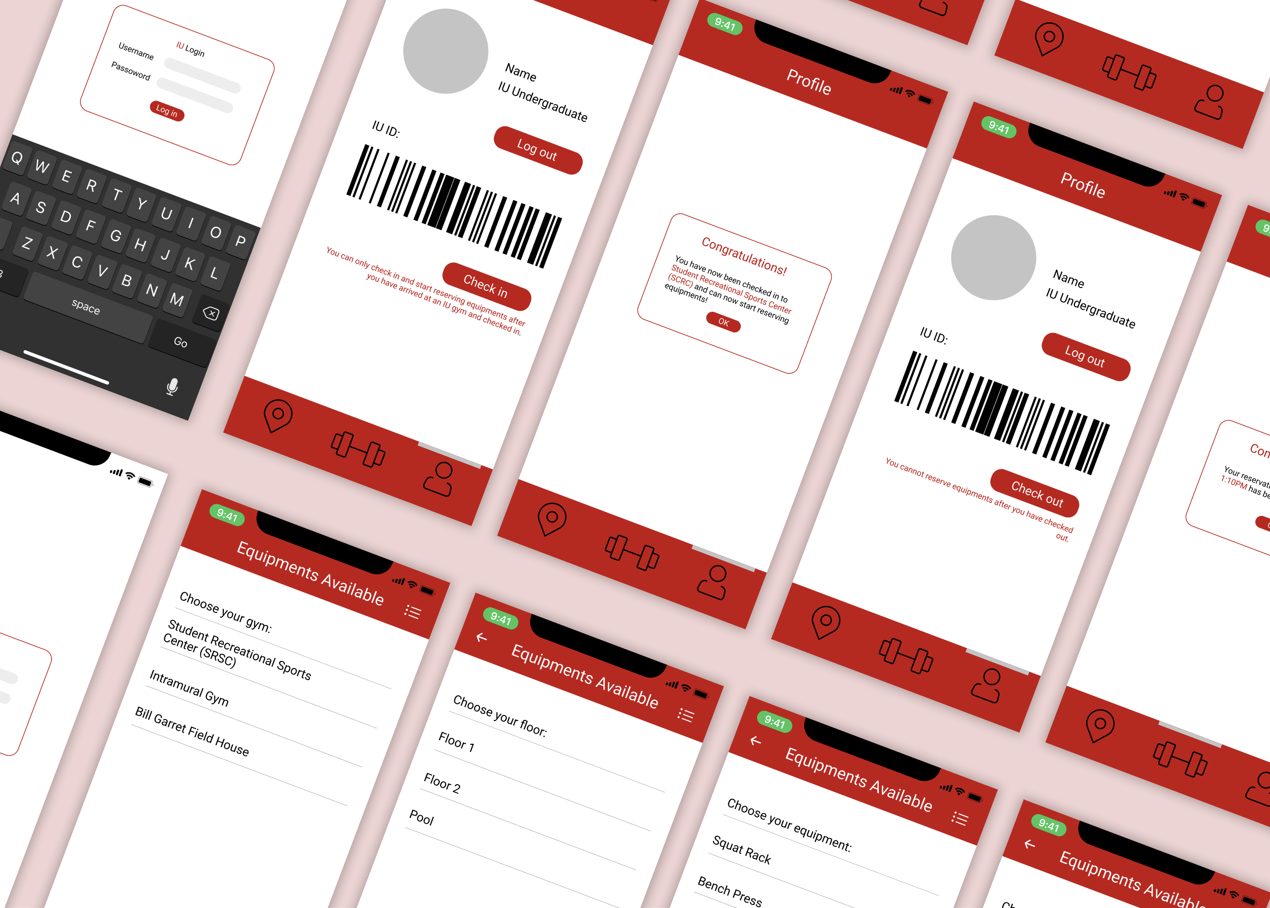
Simple and aesthetically pleasing log in screen that complies with university design guidelines.


Easy Check-In and Check-Out process using digital barcode instead of carrying university ID.
Ability to reserve a spot at the gym at pre-planned time, so that gyms won't be overcrowded and students can manage their time better.


Map to aid in navigation; find out which gym is the closest to you and how crowded it currently is.
Ability to check reserved gym and equipments, cancel if needed.


Through the course of two weeks, we conduced 12 interviews, and made both organic (6) and technical (6) observations.
.jpg)
Key Takeaways:
- students prefer the campus gym because its free
- students want more equipments
- gyms are often overcrowded (extended wait time)
- busy schedule limits available time to exercise
- transportation to the gym can be difficult for those living off campus
We wanted to create a solution that can target all the points listed above. It's difficult to add more equipments because it's expensive and the gym might not have space for more equipments. How can we utilize the same number of machines while increasing efficiency of students' workouts?

- needs a time slots screen for scheduling machines
- add map to the navigation screen
- include student ID screen for easier scanning entry

We created a medium fidelity prototype so it can be used to gain some more feedback.

"... I would need a list of reserved equipments so I can see which ones I have reserved."
"I enjoy how easy it is to navigate the app... but how do I cancel a reservation?"
"Maybe including a sample exercise that users can do on each machine? Or pictures of the machines..."

The final prototype includes many functions that can be useful for students interested in going to the gym. This app is aimed to improve time-efficiency at the gym by reserving spots before-hand to shorten wait time.
Functions include:
-Check-in and Check-out using bar code ID scan
-Reserving a spot at selected gym
-View popularity at the gym
-Reserving a machine at certain time slot
-Cancel reservations
We conducted more user testing by asking the users to follow simple directions to complete some tasks in the app. The user is then asked to answer a few questions about their experience using the app.
🔍 Easy navigation
🗣 Immediate feedback
🎨 Uniform design
🤳 Can foresee themselves using the app
🏋️ Pictures of machines/exercises
📍 Navigation to the gym
🔲 More visual hierarchy
📝 Section to submit feedback
This project was the first complete app redesign that I've done within Figma. It was a challenge because everything was new to me, but that was what made the challenge fun and engaging. This project taught me how to work collaboratively on an UX project with team members. It also taught me the importance of keep going back to the users for feedback after every step. This way, it ensures that the app we created is actually useful for our clients and can be fit into their daily lifestyle.